Press & partners
eSIM Trip brand kit
Official logos, color system, typography, and usage rules so partners, media, and developers can represent eSIM Trip consistently across web, apps, and print.
Download-ready reference for eSIM Trip brand identity: primary and light logos, orange and purple palette, Google Sans typography, favicons, app icons, and accessibility-minded color guidance.
Use this page as the single source of truth for eSIM Trip visual identity. Prefer vector (SVG) logos on screens; reserve PNG for slides and print. When in doubt, choose maximum contrast and leave generous clear space around the mark.
Identity
Logo variations
Pick the lockup that matches the background. Do not stretch, recolor outside this system, or place the logo on busy photography without a solid plate.

Primary logo
Default full-color lockup for light backgrounds and product UI.
- Format
- SVG
- Use on
- Light backgrounds

Light logo
Single-color light mark for navy, charcoal, or photography with dark overlays.
- Format
- SVG
- Use on
- Dark backgrounds

Dark logo
Alternative dark-friendly variant where the light mark is not suitable.
- Format
- SVG
- Use on
- Dark themes

Icon only
Square mark for favicons, app shells, and tight UI spaces.
- Format
- SVG
- Use on
- App icons, favicons

Dark icon
Inverted icon glyph for dark mode toolbars and status areas.
- Format
- SVG
- Use on
- Dark mode UI

PNG logo
Raster export for Office templates, sponsorship decks, and print.
- Format
- PNG
- Use on
- Print & slides
Color system
Palette
Built for digital products and marketing. Tap a swatch to copy the hex value. Pair oranges with neutrals for readable body copy and WCAG-friendly contrast.
Primary oranges
Secondary purples
Neutrals
Typography
Type scale
Google Sans is the primary voice; Inter and system fonts keep layouts stable where webfonts do not load.
Font stack
Primary
Google Sans
Headings, marketing headlines, and UI labels.
Fallbacks
Inter, system-ui, sans-serif
Keeps paragraphs readable across devices and browsers.
Examples
Display
Hero / 48–64px, bold
Section title
H2 / ~32–40px, bold
Lead sentence
Large body / ~18–20px, semibold
Body text stays neutral for long reads. Aim for comfortable line height (1.45–1.6) on mobile.
Body / 16px, regular
Media library
Icons & supporting assets
Favicons, PWA icons, social previews, illustrations, and checkout marks used across eSIM Trip surfaces.


Favicon set
Crisp marks from browser tabs to Android home-screen shortcuts.
- Formats
- PNG, ICO, SVG
- Notes
- 16×16 through 512×512


App icons
Maskable-ready PNGs for install prompts and splash screens.
- Formats
- PNG
- Notes
- 192×192 & 512×512

Social preview
Default Open Graph artwork for links shared on social platforms.
- Formats
- JPG, PNG
- Notes
- 1200×630 recommended

Illustrations
Lightweight SVG scenes used in onboarding and marketing.
- Formats
- SVG, PNG
- Notes
- Web & email


UI elements
Motion and feedback glyphs for loaders and success states.
- Formats
- SVG
- Notes
- Product UI


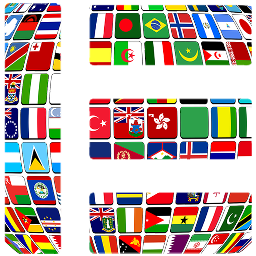
Payment marks
Card-brand artwork as shown at checkout; do not alter aspect ratio.
- Formats
- SVG, PNG
- Notes
- Checkout & footer
Distribution
Request official files
Bundled logo packs and guideline PDFs are provided on request so we can track usage and send updated assets when the brand evolves.
Logo pack
SVG and PNG lockups, icon-only marks, and naming conventions.
Request logo packGuidelines PDF
Printable one-pager with color specs, clear space, and partner dos and don'ts.
Request PDFImage bundle
High-resolution campaign art and illustration sources for approved partners.
Contact marketing
Rules of use
Brand guidelines
Practical guardrails for partners: clear space, minimum size, color roles, and type hierarchy.
Logo usage
Clear space
Keep at least the height of the “e” in “eSIM” as padding on every side so the mark never feels cramped.
Minimum size
Digital lockups should be no shorter than 32px in height; print no smaller than roughly 1cm for legibility.
Color pairings
Use the full-color logo on light neutrals; switch to the light logo on dark fills or photography with dark overlays.
Color & accessibility
Primary orange
Reserve #EE6825 for primary actions, key links, and brand emphasis—not for long paragraphs.
Secondary purple
Use #9A49FF for secondary emphasis, charts, and highlights that should feel energetic without overpowering orange.
Contrast
Text and icons should meet WCAG AA against their background; test pairs when placing type on tinted panels.
Typography
Headings
Bold Google Sans with clear size steps so pages scan quickly.
Body
Regular weight for paragraphs; keep line height near 1.5 for readability.
Links & CTAs
Primary orange for actions; always include visible focus and hover states.
Common questions
Who may use the eSIM Trip brand kit?
Press, affiliates, enterprise partners, and sponsors who reference eSIM Trip in articles, apps, or events. If you are unsure, contact support with your use case before publishing.
Which logo should I use on a dark background?
Use the light or dark logo variants designed for dark surfaces. Avoid placing the full-color orange mark on low-contrast photography without a solid backing plate.
What file format should I prefer?
SVG for websites and product UI for infinite scaling. Use PNG or PDF exports supplied in the logo pack for slide decks, print, and email where vectors are not supported.
How do I get updated assets?
Request files through support so we can share the latest bundle and note any recent brand changes. Do not trace or redraw the logo from screenshots.